Good & Bad Designs
Bad Design
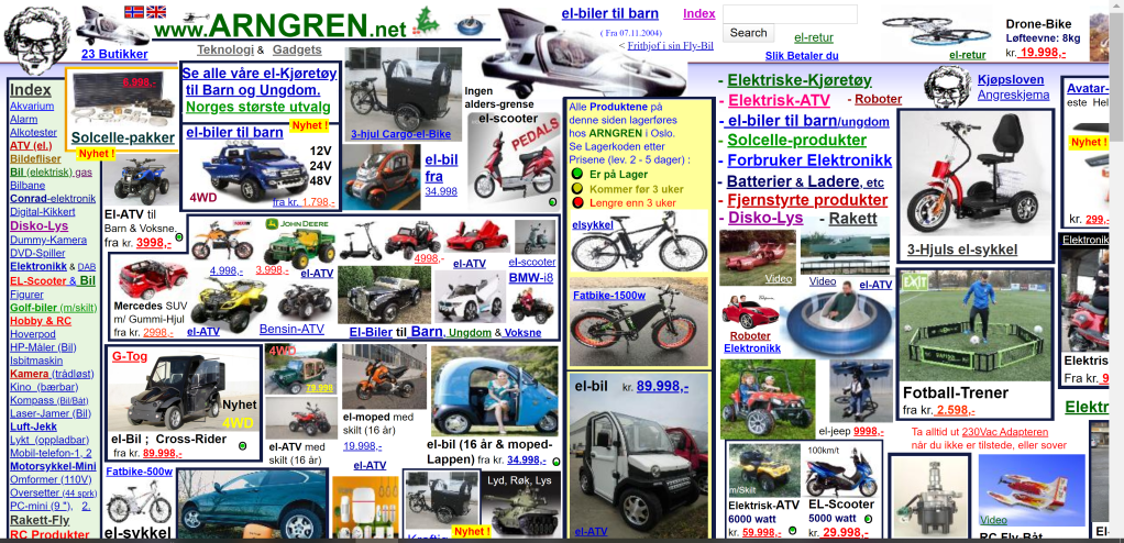
Norwegian Classified Website
When I first look at this website, I felt like something was wrong so I was seeing so many ads on the website. But, later I found that the website is designed in the way it is, with very confusing and tiny bits of information everywhere on the webpage.
There are many reasons that I think this the design of the website above is an example of bad design. First of all, it’s not clear and obvious about what actually the website is and hence the website is not understandable. Secondly, the randomness of the use of colors and the compact formatting of the content makes the website a category of bad design. And lastly, the confusing fonts and styling, as well as poor navigation, makes it really difficult to follow through every detail on the website.
So, these reasons mentioned above make the website a badly designed website which is really irritating to watch. In my view, the website is designed in a very bad way and it’s nowhere near to be understandable to any users with its puzzling formatting and random fonts and colors.

Good Design
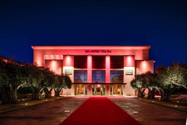
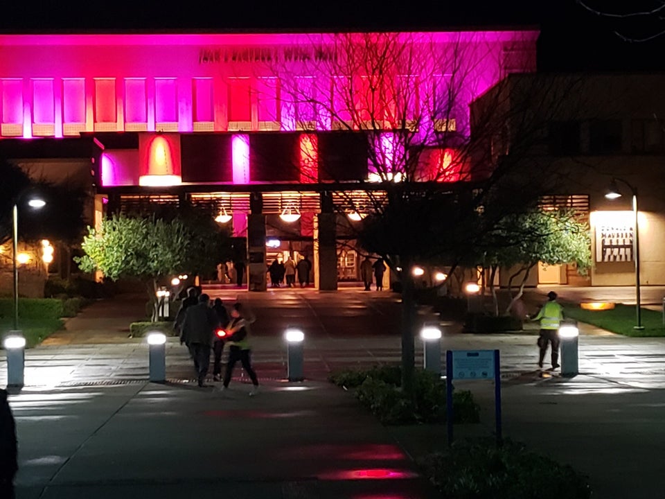
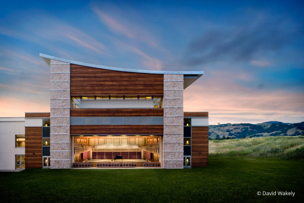
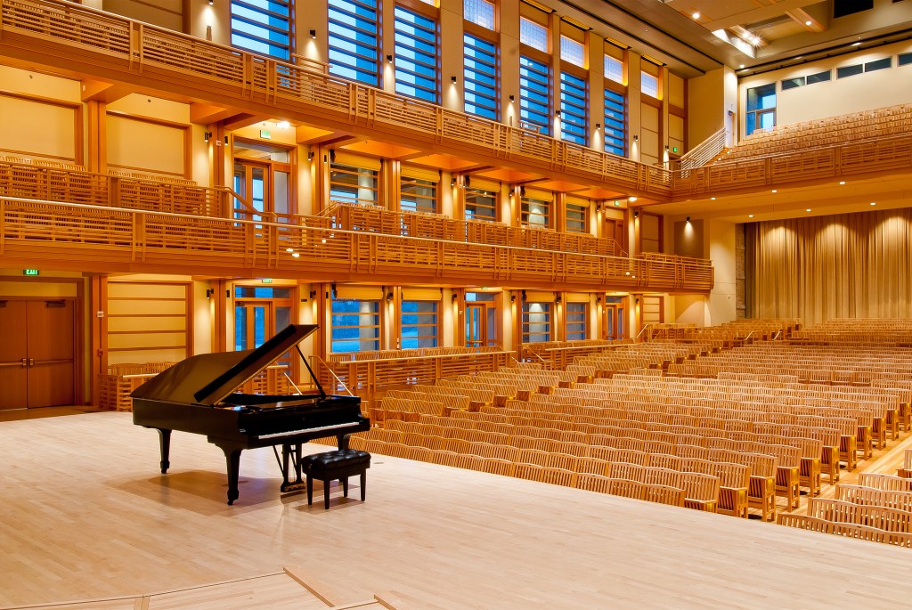
Weill Hall, Sonoma State University
The design of Weill Hall is one of the most attractive and eye catching designs that I have seen since my first visit to the campus. I was always wondering about the great lighting design that was visible from the road nearby. I visited the building where I found the interior as well as exterior design of the building very appealing.
When I look at the building from the outside it gave me a sense that the building has some purpose of doing some entertainment. After my visit, it turned out right that the building was for entertainment indeed. The interior of the building was designed in such a way that it will account for various purposes of performance events. Not only the lighting of the exterior of building is what attracts most but also the interior lighting design techniques make anyone say ‘Wow’.


Nice job Bippin
LikeLiked by 1 person